Monday, November 17, 2008

BASKERVILLE v. BOOKMAN -- FINAL SHOWDOWN

  • SERIF FONTS!
  • bookman has very slight modulations compared to baskerville's dramatic ones
  • bookman has thicker serifs
  • bookman has a wider setwidth
  • the bottom counter of the baskerville g is open


baskerville WINS!

Wednesday, November 12, 2008

Wednesday, November 5, 2008

Shelley Andante v. Snell Roundhand

  • both are script!
  • Shelley is fancier... the crossbar of the A is a huge swash, whereas the A-crossbar on Snell is straight and plain
  • some of the letters are incredibly similar... Shelley has a wider setwidth, though
  • Snell has round, circular swashes, and Shelley has kind of zig-zag swashes
  • similar stress
It's a tie

Wednesday, October 29, 2008

:'(

my car is being totalled tomorrow

i had to sign it over to the insurance company today

i miss it terribly

Monday, October 27, 2008

univers 65 v. meta

COMPARISONS!!!!

let's see how fast i can do this!

UNIVERS 56 v. META!

  • both are sans-serif fonts with very little modulation!
  • both have double-story "a"s!
  • Univers has a geometric g
  • the terminals of letters such as m, n, r, u, t, etc, all curl away slightly
  • Univers 65 is heavier than meta
  • META WINS!

Wednesday, October 22, 2008

Cochin v. Cheltenham

Cheltenham and Cochin are both serif fonts. Cochin has higher contrast and isn't as heavy as Cheltenham. The x-height on Cochin is lower. The set widths of both are about the same. The terminals of Cochin are flat and feel more calligraphic than Cheltenham's rounded teardrop terminals.

COCHIN WINS!

Thursday, October 16, 2008

Typographic Genealogy

There they are. I'm proud of this...

So I just downloaded a bunch of free fonts off myfont.com, fontshop.com, and typophilia.com... museo 500, museo sans 500, quicksand (a mediocre font with really bad spacing... but hey, it was free!!), anivers, designal LW20, chambers sans... and i think that's it. i really can't remember. I'm way tired. I was watching The Naked Archaeologist and I noticed all the strange type they use on that show... Arnprior? Why would anybody use that when talking about Judeo-Christians? Maybe I'm just missing something.

Goodnight.

Sunday, October 12, 2008

Typeface Showdown: Palatino v. Goudy

Both Palatino and Goudy are serif-faces with similar x-heights and set widths. However, Goudy is slightly narrower and Palatino is slightly taller, in terms of x-height. Goudy has more modulation and higher contrast between the thick and thin strokes. The brackets to Goudy's serifs are more pronounced. Though still triangular, Palatino's serifs are flatter than Goudy's. The bowls on the R and P do not connect to the stem in Palatino.

Goudy wins.

Poster Illustration


"pomegranates!"
--Matt Duerr (19, tall, single, and very ready to mingle)

Monday, October 6, 2008

Typeface babies

The two faces I have to merge are Akzidenz Grotesk Bold and Arnold Bocklin. I don't like either. I decided to do names that only old people would have because Arnold Bocklin screams 1970's-old-person-brown-pants-and-weird/bad-shirts sort of style to me. Therefore, I asked my mom to give me some names of some of the older people in my family... (except Alejandra... that was my first one and I just blindly threw that in there...)

I'm thinking of dropping Bessie because I feel like I've done all I can with those letters... (sorry, Great-Grandma...). I'll probably use Auntie Em or something and try some different letters.

I love... / I hate...

Museo Sans!!
plus... I thought this was a joke... but I was horribly wrong...


Comparison between BauerBodoni and Century Oldstyle

First, both are serif typefaces. Century Oldstyle has teardrop terminals on letters such as a, c, f, g, j, etc, whereas BauerBodoni has ball terminals. There is higher contrast between the modulations and the stem weights of BauerBodoni than in Century Oldstyle. Century Oldstyle has bracketed serifs, in contrast to BB's slab serifs. The x-height of BB is shorter than CO and the set width of CO is wider than BB.

Because of all of this, BauerBodoni is the superior typeface in my book.

Sunday, October 5, 2008

Experimental Type -- take 3


experimental type-- take 2


The reason I work...


Why do I drive 9 hours round trip home once every 28 days to work at Chilis?

Yeah, I do it for the money.

Hence, my most recent paycheck.

Thursday, October 2, 2008

Sunday, September 28, 2008

prepping


here's my 20 objects... i'm worried about how interesting they are, but since i forgot about it until tonight, it's the best i can do right now :-\
so yeah, i have a ceiling fan pull-chain, handcuffs, a napkin ring, tweezers, a couple of different handmade stamps, my Jesus ring, different kinds of earrings, a pendant, my dad's mail key, charm bracelet, button, the screw thing for frame hanging, one of the things to hang my Ikea mirror, a couple of different paperclips... etc. Okay, I'll throw in a cup hook for good measure.

Saturday, September 27, 2008


Here's my travel poster in progress. Please ignore the hideous colors... they're serving merely as placekeepers while i'm penning everything in. Imagine that it's better, and you'll have a good idea of how it will turn out.

Figure/Ground final product


Well here's 20% of my final grade... I hope it pulls it's weight...

I'm actually not 100% sure that this is exactly what the final looks like... I've kind of been messing with the files on my computer today since I installed the new versions of Illustrator and Photoshop, and when I went to Kinko's last night it was perfect, so... yeah. Anywho, this has been a brilliantly worry-free weekend. Nothing to do but laze around and eat and watch tv. Se7en is an intense movie, btw. That's what I did last night instead of any other homework :-)

finally!

I am now the proud owner of CS3 Design Premium and a free CS4 upgrade :-)

and yes, this is how i feel.

Monday, September 15, 2008

WHERE IS VENT?!?!?

Friday, September 12, 2008

whatever this is...


i realized too late that you can't mix uppercase with lowercase. oh well. i just won't do it again :-\

Monday, September 8, 2008

if you could...

So I was looking at one of my favorite indie music poster designer's websites (Jason Munn at http://www.thesmallstakes.com/ ) and I stumbled across "If You Could..."

Check it, yo:


"Every month of 2008 If You Could will be
releasing two new screenprints, one from an established artist and one from an
emerging.
Responding to the question, ‘If you could do anything tomorrow,
what would it be?’, these two colour, B2 (655 x 480 mm), limited edition
screenprints are only available to buy from the If You Could website for the
duration of that month.
This creates unique editions, determined by the
amount purchased and are individually signed by the artist and dispatched by
recorded delivery two weeks after the last day of the month.
As with all If
You Could projects a personal touch is important and every print is stamped for
authenticity, printed at a local screen printers, and where possible taken in
person to the artist to be signed."

Here are some of the poster designs...

-Jason Munn of thesmallstakes.com

-Rob Ryan of misterrob.co.uk ...and here's the link: http://www.ifyoucould.co.uk/prints


I thought it was really cool and it inspired me to... drive to Highland Village to get a Jamba Juice. I'm kidding, even though I did shortly after reading this. The two events were completely unrelated. It did, however, make me want to buy more screenprints. But I don't have any room for anymore on my walls :-( I'm trying to give one away already (any Ted Leo fans?)

Monday, September 1, 2008

Sunday, August 31, 2008

monograms #25-36


Here is my third page of thumbnails for the monograms...

Some of my monogram thumbnails


I enjoy this! I really do!

Saturday, August 30, 2008

1/2 of the 1st day project

Arrighi 72 pt


Granjon 72 pt

Haarlemmer Sans 72 pt


It definitely gave my hand a workout! And it reminded me again just how happy I am not to be in the dorms anymore... this would've been impossible for me if I was trying to do this on my bed back at Bruce like in the good old days! Poor Becca wouldn't have gotten any sleep either. Thank God for apartments.
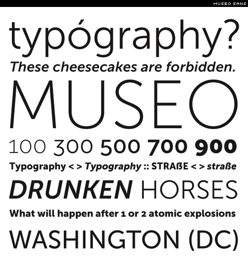
Wednesday, August 27, 2008

It's so easy, a caveman can do it!

This is my first post.

I would say more, but I have to go help make some chicken parmesan, and I have lingered far too long online checking out other people's blogs. My friends are getting antsy!

A presto, signori e signorine!