
Wednesday, October 29, 2008
:'(
my car is being totalled tomorrow
i had to sign it over to the insurance company today
i miss it terribly
i had to sign it over to the insurance company today
i miss it terribly
Monday, October 27, 2008
univers 65 v. meta
COMPARISONS!!!!
let's see how fast i can do this!
UNIVERS 56 v. META!
- both are sans-serif fonts with very little modulation!
- both have double-story "a"s!
- Univers has a geometric g
- the terminals of letters such as m, n, r, u, t, etc, all curl away slightly
- Univers 65 is heavier than meta
- META WINS!
Wednesday, October 22, 2008
Cochin v. Cheltenham
Cheltenham and Cochin are both serif fonts. Cochin has higher contrast and isn't as heavy as Cheltenham. The x-height on Cochin is lower. The set widths of both are about the same. The terminals of Cochin are flat and feel more calligraphic than Cheltenham's rounded teardrop terminals.
COCHIN WINS!
Thursday, October 16, 2008
Typographic Genealogy
 There they are. I'm proud of this...
So I just downloaded a bunch of free fonts off myfont.com, fontshop.com, and typophilia.com... museo 500, museo sans 500, quicksand (a mediocre font with really bad spacing... but hey, it was free!!), anivers, designal LW20, chambers sans... and i think that's it. i really can't remember. I'm way tired. I was watching The Naked Archaeologist and I noticed all the strange type they use on that show... Arnprior? Why would anybody use that when talking about Judeo-Christians? Maybe I'm just missing something.
Goodnight.
Sunday, October 12, 2008
Typeface Showdown: Palatino v. Goudy
Both Palatino and Goudy are serif-faces with similar x-heights and set widths. However, Goudy is slightly narrower and Palatino is slightly taller, in terms of x-height. Goudy has more modulation and higher contrast between the thick and thin strokes. The brackets to Goudy's serifs are more pronounced. Though still triangular, Palatino's serifs are flatter than Goudy's. The bowls on the R and P do not connect to the stem in Palatino.
Goudy wins.
Goudy wins.

Monday, October 6, 2008
Typeface babies
The two faces I have to merge are Akzidenz Grotesk Bold and Arnold Bocklin. I don't like either. I decided to do names that only old people would have because Arnold Bocklin screams 1970's-old-person-brown-pants-and-weird/bad-shirts sort of style to me. Therefore, I asked my mom to give me some names of some of the older people in my family... (except Alejandra... that was my first one and I just blindly threw that in there...)

I'm thinking of dropping Bessie because I feel like I've done all I can with those letters... (sorry, Great-Grandma...). I'll probably use Auntie Em or something and try some different letters.


I'm thinking of dropping Bessie because I feel like I've done all I can with those letters... (sorry, Great-Grandma...). I'll probably use Auntie Em or something and try some different letters.
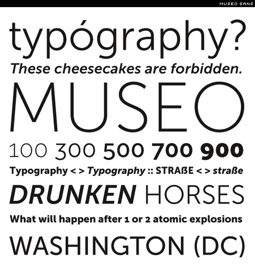 Museo Sans!!
Comparison between BauerBodoni and Century Oldstyle
First, both are serif typefaces. Century Oldstyle has teardrop terminals on letters such as a, c, f, g, j, etc, whereas BauerBodoni has ball terminals. There is higher contrast between the modulations and the stem weights of BauerBodoni than in Century Oldstyle. Century Oldstyle has bracketed serifs, in contrast to BB's slab serifs. The x-height of BB is shorter than CO and the set width of CO is wider than BB.
Because of all of this, BauerBodoni is the superior typeface in my book.
Sunday, October 5, 2008


The reason I work...

Why do I drive 9 hours round trip home once every 28 days to work at Chilis?
Yeah, I do it for the money.
Hence, my most recent paycheck.
Thursday, October 2, 2008


Subscribe to:
Posts (Atom)
